
This cartoon is good. Very Good.
(FWIW, I definitely identify as a Pythagorean rather than a Trigonometric)
It came from “The Saturday Paper”, an online Australian newspaper. Here is a link to the original cartoon, and the paper.
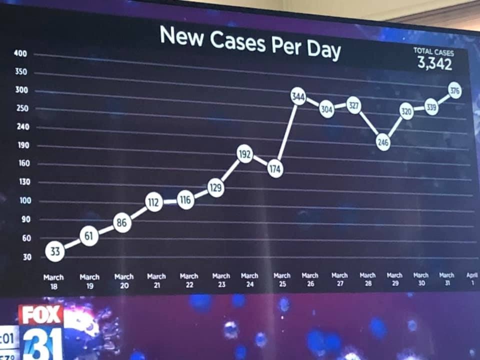
And now we contrast it with something that is both bad and ugly. It is perhaps no surprise that this monstrosity comes from Fox News. Just look at that y-axis (if you dare) and weep.
Now go back up to the top of this post and look again at the brilliance of that cartoon. Hopefully it will erase the memory of that shockingly bad graph,