I continue to crunch the numbers, and explore different ways to display the data.
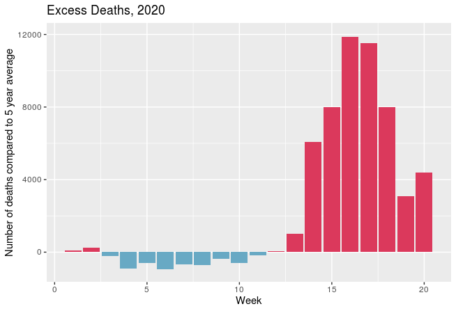
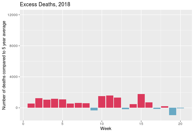
In the graphs above, I have taken the total number of weekly deaths in England and Wales (as reported by Office for National Statistics) and subtracted from that the average number of deaths for that week.
Before the outbreak of Covid 19, 2018 had been a “bad year” for deaths, with the weekly death rate often being above the 5 year average (see graph of cumulative deaths, below) so I plotted that – on the same scale – to make an easy comparison with the tragedy of this year.