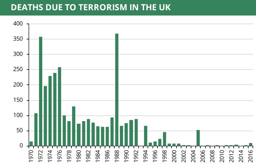
I came across the graph above and I was immediately struck by the stories it tells by forcing you, the reader, to ask the obvious questions.
Clearly something happened in the 1990’s.
The peace process was begun in Northern Ireland, culminating in the Good Friday Agreement of 1998. Surely this graph alone is enough to convince anyone of the importance and historical significance of the Good Friday Agreement? Why would anyone do anything, anything, to jeopardise its continued success? If anyone should need any convincing that we shouldn’t, we mustn’t, return to a hard border on the island of Ireland, then surely this graph must be all it takes.
86% of the deaths between 1970 and 1990 were in Northern Ireland
1988 – includes 271 deaths due to the Lockerbie bombing, when Pan Am flight 103 from Frankfurt to Detroit, via London & New York, was destroyed in the air over the Scottish town of Lockerbie by a terrorist bomb.
2005? The tragedy of the London bombings, or 7/7
A simple, sobering graph, but one that deserves – demands – to be viewed.