Whether or not it gives us a good government is a question I leave for you. But what a general election does give us is data and I like data.
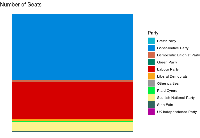
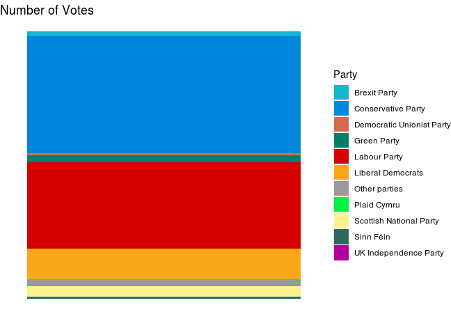
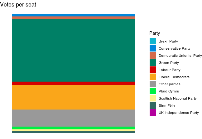
So I crunched some numbers and came up with the three charts, above. I haven’t included any numbers as I quite like the aesthetic look of the charts and I think (hope) that they are fairly self explanatory.
What they do show is how many more votes the Green Party and (to a lesser extent) the Lib Dems needed to secure each of their seats compared to most other parties. I did run a plot to look at how the seats would be distributed under Proportional Representation, but the chart was the same as the “Number of Votes” chart. A moments thought and it dawned on me that this was to be expected. On these numbers, the Greens and Lib Dems would be the big winners under a PR systems, whilst the Conservative Party, along with the “regional parties” – SNP, Sinn Fein, DUP & Plaid Cymru – would all find themselves with fewer seats. Interestingly, the Labour Party would have 6 more seats had this election been run under PR.
I was originally going to produce the data a pie charts, but they didn’t render well my stats package (ggplot in RStudio), unlike the bar charts above. (Sorry – got a bit geeky there for a moment.)
In researching this post, I found that all data from General Elections from 1918 can be accessed via The House of Commons Library
To access the data set, click on this link, then scroll to the bottom of the page to find “Supporting Documents” and the data can be downloaded as an Excel spreadsheet