Russia 2018 – its turning out to be a vintage World Cup.
We’ve had shocks, upset and – at the time of writing – England are still in it (with a supposedly “easy” route to the final. Half of me dares to hope, the other half fears we will be dumped out tomorrow night by the Colombians.)
It is also the the tournament when stats and data have come of age, and are readily available to those of us who find the numbers (almost) as entrancing as the fancy footwork.
As I did at the end of Euro 2016, I will “Rank the rankings”: compare the finishing positions with the FIFA world rankings. There was no significant correlation in the Euros, and with only four of the top ten still in the competition, it doesn’t look to good this time round, either.
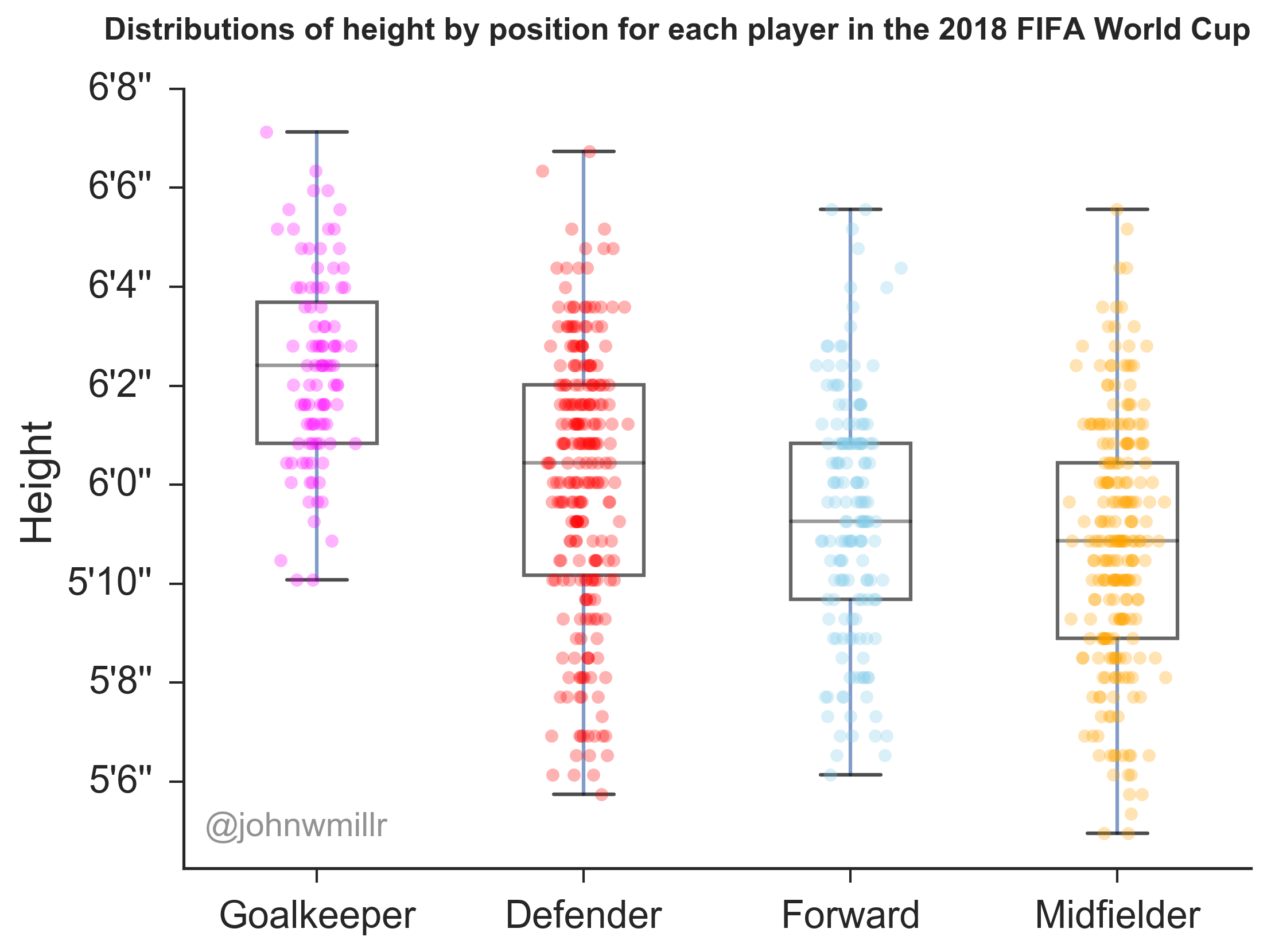
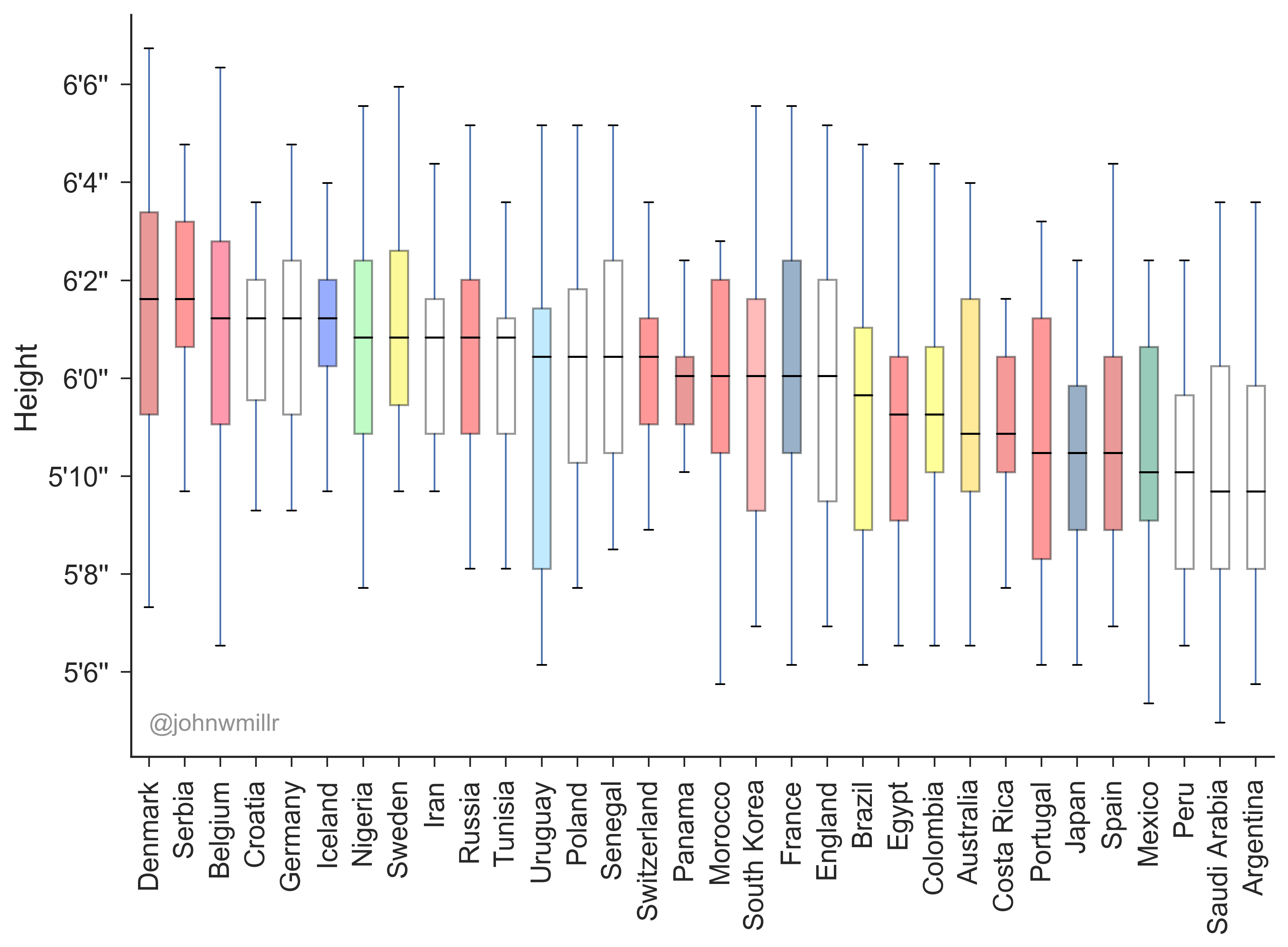
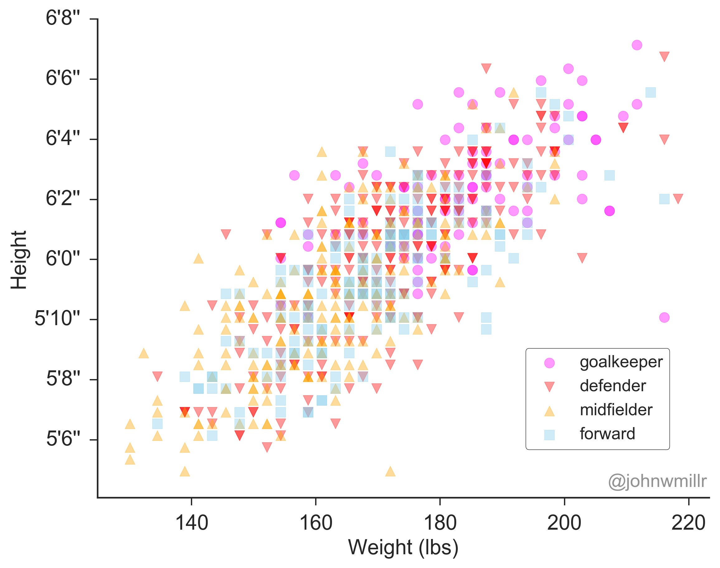
But that must wait until the conclusion of the competition. Today, I wanted to share some great work by John W. Miller who has produced the box plots and scatter graph on this page. You can read his full blog post here where he will also talk you through how to get your hands on the data he used.
Some great charts that should spark some interesting discussions in the classroom.

Distribution of Player Height sorted by Country

Height vs. weight by player position
Large Data Sets are the current buzzword in A level maths, and it is wise to ensure that your students are familiar with the data set provided by the exam board you are following. However, here is another large data set containing (nearly) 40,000 international football results from 1872 to 2018: to my mind far more interesting than the transport arrangements of unitary authorities.
And here are the World Football Elo Ratings – I must confess, I’m not (yet) 100% sure how an Elo rating is calculated, but I shall try and find out.
So, whether it ends in cheers or (more likely) tears, when the competition is over, we can fill the void by exploring all the wonderful stats and data the beautiful game generates.
(And thanks again to John W. Miller for allowing me to use his images. If you, or your students, have a penchant for data and computer science, his blog is well worth a visit.)