The football may be over, but the fun never stops!
There is plenty of data on the recent Russia 2018 World Cup to be found on the Official Fifa site
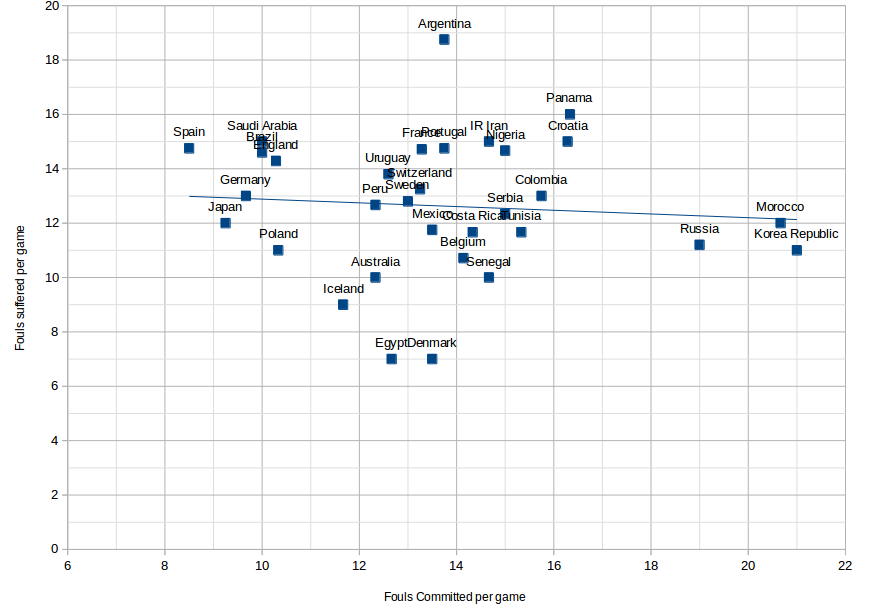
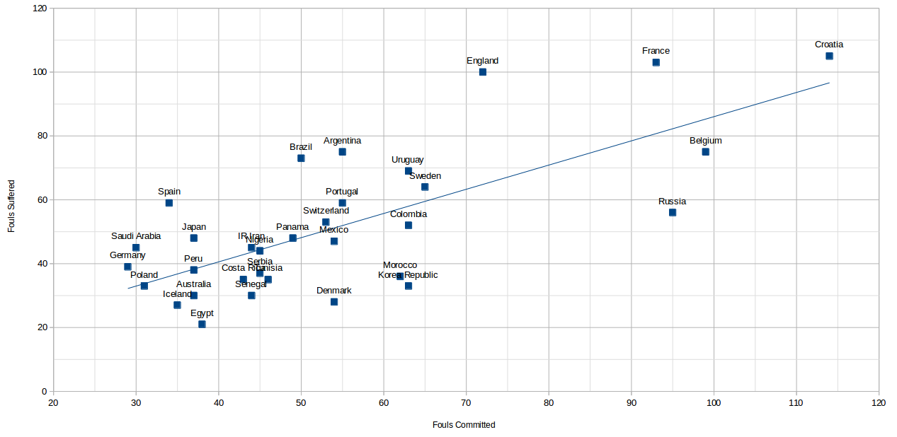
Using their statistics, I have compared the number of fouls committed versus the number of fouls suffered and plotted the scatter graph above. Fouls committed are on the x axis, fouls suffered on the y. The line is a (computer generated) line of best fit using linear regression.
The greater the distance above the line, the more “saintly” we can say a team was – more fouled against than fouling; those below the line were the “sinners” of the tournament.
Using my criteria, we can say that, despite not coming home with the trophy, England were the Saints of the World Cup!
(A note of caution, however. As ever with data, we must always consider its validity. Despite this data coming from the official FIFA website, it has a total of 1734 fouls committed, but only 1642 fouls suffered – at the time of writing I can’t reconcile the difference.)
UPDATE
A few readers have (correctly) pointed out that the plot is skewed as not all teams play the same amount of games: one would expect France, Croatia, Belgium and England to all be towards the right of the graph as they played more games than other teams.
So I went back to the data produced a plot for fouls committed per game v fouls suffered per game. You can see the plot below. I think we can safely say those above the line were the saints, those below the sinners.